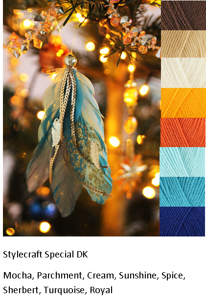
 | I believe this photo is a Christmas ornament, and I fell in love with the unique colors for this time of year, and the contrast of the yellows and oranges and the turquoise feathers. |
|
0 Comments
Alot of people have been asking me how I select colors from the photos for color inspiration boards. I've made two videos on how I do it. They're not professional videos by any means, just me, sort of teaching you how to do it. Heres' the two videos. Part one:
I've been focusing so much on the facebook group, that I seem to have forgotten that I was also trying to make a blog! Oops! Anyway, now that I remember, I'll try to post my upcoming projects and more color board here! I've also discovered a few new types of yarn, so I may have more reviews up soon. I have also updated this website to include a shop, so you can now purchase directly from me!
Knit Picks has a variety of yarn, but my favorite to use is Brava Worsted. It's premium acrylic, and is $1.99 for 100 grams (218 yards). I've mixed this with Hobby Lobby's I love this yarn, and Red Heart Supersaver, and had no problems. It reminds me a bit of Caron Simply Soft, just because it's so soft and sort of shiny, however, it does not pill, and it comes in lots of colors. It also has a nice drape. Theo ther thing I like about Knit Picks (all their yarn), is they tell you more about each color, and what it goes best with, if you click on the color. For example, it tells me: Cornflower is a color that falls in between lighter shades of blue and green, similar to a soft turquoise or a robin's egg blue with slightly more green undertones. Cornflower is also a calm and tranquil shade that is sure to add a pop of color without being overpowering. 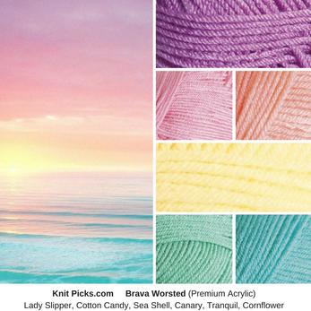 These pastel rainbow tints remind me of this sunrise over the ocean. These colors, along with white would look beautiful in a striped afghan.
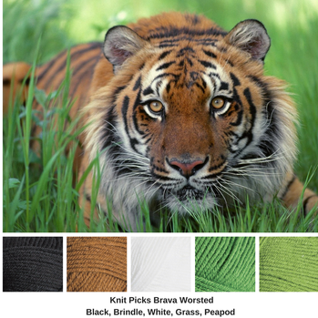 I've always loved tigers, and this tiger's eyes are so intense.
When I first discovered Knit Picks yarn, one of the first shades I bought was Brindle. It's a lovely orangey copper color, and is perfect for this tiger. The greens were a bit harder to match, but these two greens, along with the black and white should make a lovely tiger-colored project. 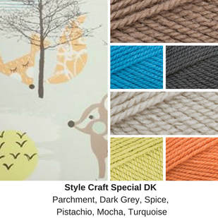 A lovely lady asked me to help her select yarn colors that go with this wallpaper in her nursery.
Since I knew she was making an afghan to go in this room, I recommended that she use very little of the parchment in the blanket and more of the blues, oranges, and browns. Since the walls were mostly parchment-colored, it's better to have it only as an accent in the finished project. This is a split complementary color scheme, as the turquoise is directly across the color wheel from these blues and oranges. 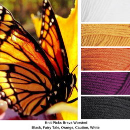 The morning of my wedding, I went to the church to get ready. The reception was outside. As the florist (my grandma) started putting the flowers out, this monarch landed on top of the cake-topper. It had a strange bulge in it's wing and couldn't fly very well, so we let it stay. It stayed all day and throughout the wedding. It finally flew away as we were taking everything down at the end of the day.
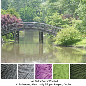 I took this photo in the St. Louis Botanical Gardens in the Japanese Garden and I love the tones of the single purple tree and the greens, partnered with the greys of the bridge.
This is a complementary color scheme with grey added. |
Archives
February 2023
Categories
All
|
 RSS Feed
