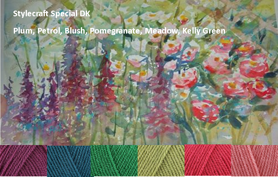
 | Dawn asked for colors from this painting to make an afghan for her daughter. This analogous color scheme is what I came up with for her using Stylecraft Special DK. |
|
0 Comments
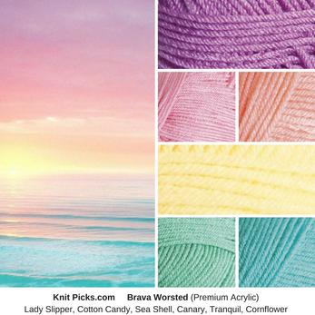 These pastel rainbow tints remind me of this sunrise over the ocean. These colors, along with white would look beautiful in a striped afghan.
 A lovely lady asked me to help her select yarn colors that go with this wallpaper in her nursery.
Since I knew she was making an afghan to go in this room, I recommended that she use very little of the parchment in the blanket and more of the blues, oranges, and browns. Since the walls were mostly parchment-colored, it's better to have it only as an accent in the finished project. This is a split complementary color scheme, as the turquoise is directly across the color wheel from these blues and oranges. 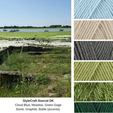 This color scheme requested through Facebook by Henen Thair, reflects the analagous colors of blue and green, with small accents of tan and grey.
 This photo was found online from Pantone. I really liked how the grey background contrasted with the colors. The pink, blue, and yellow are triad colors, meaning they are spread evenly around the color wheel. It's accented by soft neutrals to let the colors shine.
To get this same fell of this photo, I'd recommend alternating one of the first eight colors with the greys. To get this ombre effect, use the pinks and greys first, followed by blue and grey, then yellow and grey, then tan and grey. 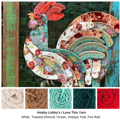 This Rooster is just lovely. It could almost be considered triadic, with the red, blues, and tan serving as yellow. However, the antique teal is almost green, and thus would be a complementary scheme with the red.
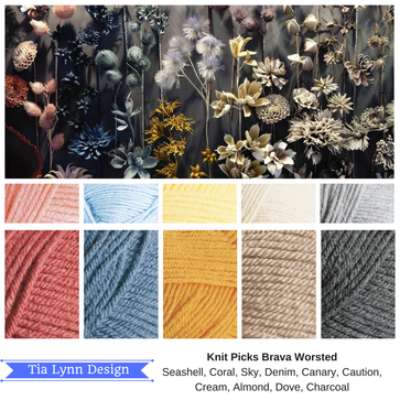
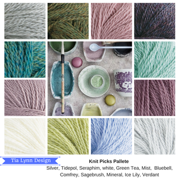 Here's another photo that I fell in love with. I love the muted tones of the pinks and purples, paired with the greens and blues. This Analagous color scheme ranges over half the color wheel, from red (pink) to yellow-green. The neutral greys and white really makes these colors pop.
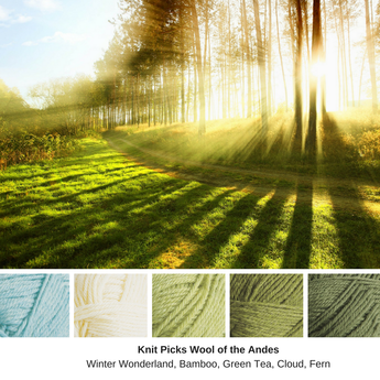 Sometimes I find color schemes before I find the photos. This was one such combo. I love the colors of Wool of the Andes. Triad greens partner with white and blue in this monochrome-analogous scheme.
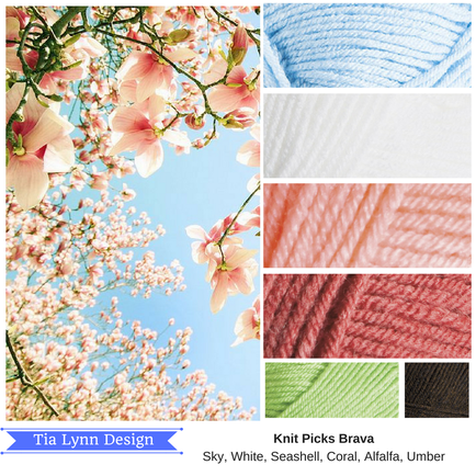
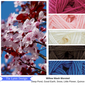 I'm not entirely sure if these are cherry blossoms, so don't get mad at me! I just love the pinks against the brilliant blue. I've been dying to use Willow Wash yarns, as they are Anti-Pilling, I just haven't found the right project or the right colors to use it yet.
|
Archives
February 2023
Categories
All
|
 RSS Feed
