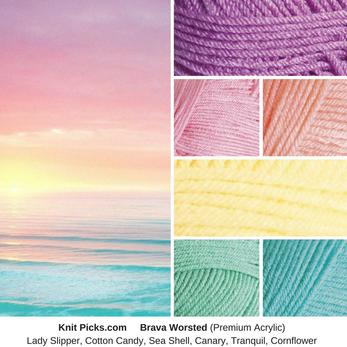
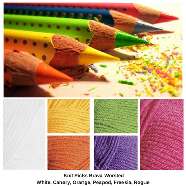
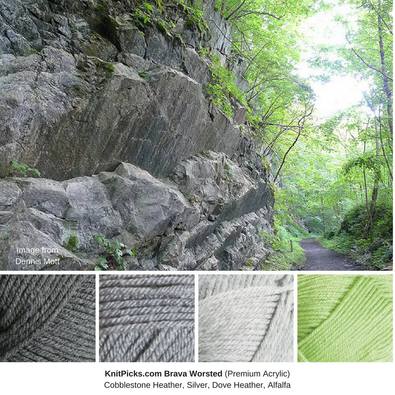
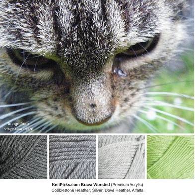
Knit Picks has a variety of yarn, but my favorite to use is Brava Worsted. It's premium acrylic, and is $1.99 for 100 grams (218 yards). I've mixed this with Hobby Lobby's I love this yarn, and Red Heart Supersaver, and had no problems. It reminds me a bit of Caron Simply Soft, just because it's so soft and sort of shiny, however, it does not pill, and it comes in lots of colors. It also has a nice drape.
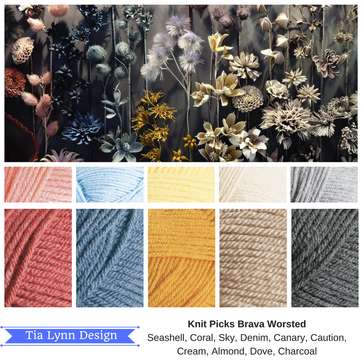
Theo ther thing I like about Knit Picks (all their yarn), is they tell you more about each color, and what it goes best with, if you click on the color. For example, it tells me: Cornflower is a color that falls in between lighter shades of blue and green, similar to a soft turquoise or a robin's egg blue with slightly more green undertones. Cornflower is also a calm and tranquil shade that is sure to add a pop of color without being overpowering.
Theo ther thing I like about Knit Picks (all their yarn), is they tell you more about each color, and what it goes best with, if you click on the color. For example, it tells me: Cornflower is a color that falls in between lighter shades of blue and green, similar to a soft turquoise or a robin's egg blue with slightly more green undertones. Cornflower is also a calm and tranquil shade that is sure to add a pop of color without being overpowering.
 RSS Feed
