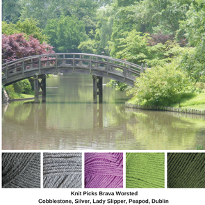
I took this photo in the St. Louis Botanical Gardens in the Japanese Garden and I love the tones of the single purple tree and the greens, partnered with the greys of the bridge.
This is a complementary color scheme with grey added.
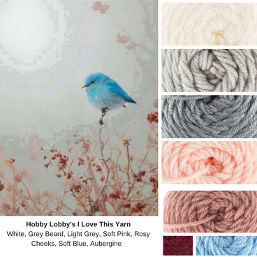
This is a complementary color scheme with grey added.


 RSS Feed
