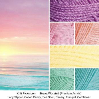
These pastel rainbow tints remind me of this sunrise over the ocean. These colors, along with white would look beautiful in a striped afghan.
|
These pastel rainbow tints remind me of this sunrise over the ocean. These colors, along with white would look beautiful in a striped afghan.
0 Comments
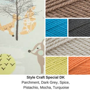 A lovely lady asked me to help her select yarn colors that go with this wallpaper in her nursery.
Since I knew she was making an afghan to go in this room, I recommended that she use very little of the parchment in the blanket and more of the blues, oranges, and browns. Since the walls were mostly parchment-colored, it's better to have it only as an accent in the finished project. This is a split complementary color scheme, as the turquoise is directly across the color wheel from these blues and oranges. 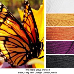 The morning of my wedding, I went to the church to get ready. The reception was outside. As the florist (my grandma) started putting the flowers out, this monarch landed on top of the cake-topper. It had a strange bulge in it's wing and couldn't fly very well, so we let it stay. It stayed all day and throughout the wedding. It finally flew away as we were taking everything down at the end of the day.
 Bright Tones mixed with white make the colors pop even more.
I love using Knit Picks Brava Worsted. It reminds me of Caron Simply Soft, but it's easier to work with. It's soft. It's got tons of color choices. 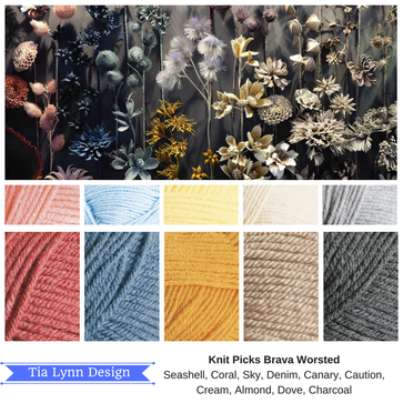 This photo was found online from Pantone. I really liked how the grey background contrasted with the colors. The pink, blue, and yellow are triad colors, meaning they are spread evenly around the color wheel. It's accented by soft neutrals to let the colors shine.
To get this same fell of this photo, I'd recommend alternating one of the first eight colors with the greys. To get this ombre effect, use the pinks and greys first, followed by blue and grey, then yellow and grey, then tan and grey. 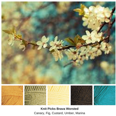 I found this photo when I was looking for inspiration for an upcoming CAL I'm working on. The blues contrast lovely with the yellow.
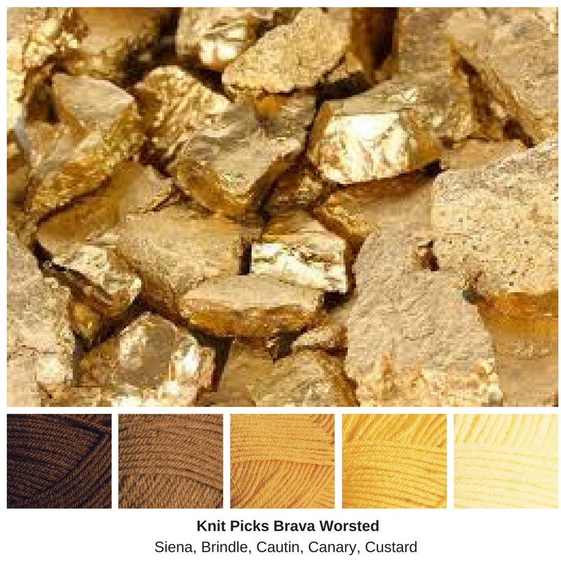
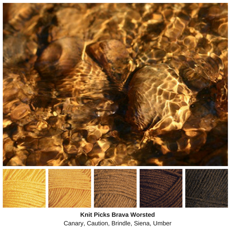
I'd been listening to the Audio Book of Walk on Earth a Stranger by Rae Carson. This was about the same time I began working on the first draft of my CAL, and I wanted to do something that reminded me of the gold that was talked about in the book. These both use similar colors, monochromatic colors, but one has a darker feel, while the other is brighter.
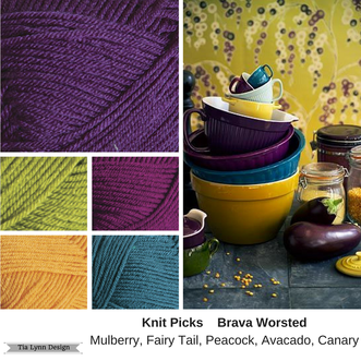 I've always loved purple and yellow together. This scheme, with blue, yellow, green, and purple is almost an analogous color scheme, but it reminds me more of a split complementary, with the yellow partnered with red-violet and blue-violet, with accents of turquoise and yellow-green.
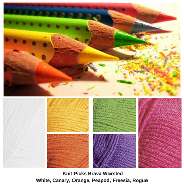
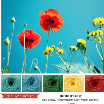 This is a classic triadic color scheme with primary colors: Red, yellow and Blue. Accents of green help the other colors pop
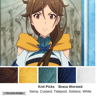 I walked through the living room one day where a Japanese anime was playing in the background, and I saw this character and fell in love with her color scheme immediately. The rich yellow contrasting the blue and turquoise with rich brown was just too much to get out of my head. I had to figure out what the show was called and this character's name, just to find this photo.
|
Archives
February 2023
Categories
All
|
 RSS Feed
